PGFPlots 1.11 released
Christian Feuersänger released version 1.11 of PGFPlots. It’s already one week ago, but regarding this special package that news is important for me, so I share it also here. Furthermore, there are news about the future development.
 I would live to highlight two of the new features. Now you can use radian in arguments for trigonometric functions, besides degree. Before, we could convert radian to degree using the deg() function, such as by sin(deg(x)), if x wasn’t given in degree. So the input of complex trigonometric expressions can be simplified. You just need to specify trig format plots=rad once as an option.
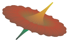
The code for the picture on the right shows “before and after”, in the answer by Christian on TeXwelt to the question, if you can switch from degree to radian with PGFPlots together with the announcement of the upcoming feature.
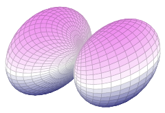
Or let’s have a look how it’s applied in a small example – here I plotted a spherical harmonics map (used in quantum mechanics), originally requested by Henri in PSTricks:

\documentclass[border=10pt]{standalone} \usepackage{pgfplots} \pgfplotsset{trig format plots=rad, compat=1.11} \usepgfplotslibrary{colormaps} \begin{document} \begin{tikzpicture} \begin{axis}[colormap/violet, hide axis] \addplot3[ surf, domain = 0:pi, domain y = 0:2*pi, samples = 50, samples y = 70, z buffer = sort ] ( {sin(x)*cos(y)*(sqrt(3/(4*pi))*sin(x)*cos(y))^2}, {sin(x)*sin(y)*(sqrt(3/(4*pi))*sin(x)*cos(y))^2}, {cos(x)*(sqrt(3/(4*pi))*sin(x)*cos(y))^2} ); \end{axis} \end{tikzpicture} \end{document} |
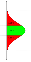
 Furthermore, adding custom annotations became simpler. Until now, you could refer to the coordinate system using the axis cs:syntax, for drawing additional lines, arrows, labels or annotations. In contrast to low level pgf/TikZ coordinates, axis cs applies logarithms, data scaling and custom transformations, so that should be choosen. Now, that’s implicitly done. For example, it could look like Elke’s filled area below a normal distribution:
\draw [dotted] (axis cs:2.698,-4) -- (axis cs:2.698,4.5); \node at (axis cs:0,1.4) [anchor=east, rotate=90] {50\,\%}; |
With the new version it can be simplified to
\draw [dotted] (2.698,-4) -- (2.698,4.5); \node at (0,1.4) [anchor=east, rotate=90] {50\,\%}; |
So less writing work and easier to read, especially if i’s used many times, such as in Elke’s plot.
That small update fixed also several bugs. With my frequent usage I stumbled only across one of them, which as now been fixed (too much whitespace with the units library under certain circumstances – i.e. bounding box too big). The README file provides further information.
Regarding the future development: in a comment to zu a question about rotation transformation with PGFPlots Christian announced, that current development of PGFPlots focuses on scalability and performance, motivated by the many 3d surface plots on TeXwelt. He already finished a prototype version, which can double the speed. This version bases on a Lua backend. I look forward to this development, since I frequently generate complex plots and compile a lot of times, until viewing angle, sampling rate, coloring and further options result in the best possible visualization.
You can use your package manager for updating PGFPlots, alternatively you can download the new version from SourceForge or from CTAN.


