Starting chapters on even-numbered pages
In documents using the book class chapters start by default on a right-hand, odd-numbered page (recto page), corresponding to option openright. This may be changed by specifying the option openany to use the next available page, which is set default in the case of the report class.
But the LaTeX standard classes don’t provide an openleft option. The memoir class accepts openleft and enables chapters to start on left-hand pages (verso pages).
The book and report class use \cleardoublepage (defined in latex.ltx) to ensure that chapters start on odd-numbered pages. The opposite could be specified by redefining the \cleardoublepage command:
\makeatletter \renewcommand*\cleardoublepage{\clearpage\if@twoside \ifodd\c@page \hbox{}\newpage\if@twocolumn\hbox{}% \newpage\fi\fi\fi} \makeatother |
This topic was discussed on mrunix.de.
Prevent floating of figures or tables
Often images are embedded using the figure environment, they can get a caption, a label for reference and they will get numbered and appear in the list of figures. Figure environments are intended to float, but sometimes it is needed to place an image exactly at a specific position, still wanting to benefit from the other mentioned features of the figure environment. A similar problem is the exact placement of tables where usually the table environment is used.
One possibility that may not always prevent floating is to set more positioning parameter:
\begin{figure}[!htbp] \includegraphics{filename}% \caption{text}% \end{figure} |
This may work well, but not in all cases.
To prevent floating at all we must not use the figure environment. The caption package gives a way to get all the other features. It provides the command \captionof that takes a counter (figure or table) as argument and of course the caption text, for example:
\usepackage{caption} ... \begin{center} \includegraphics{filename}% \captionof{figure}{text}\label{labelname}% \end{center} |
The figure counter is used for numbering and the image will be listed by the \listoffigures command.
The caption package is very recommendable, it has a lot of features and is very well documented. But if you don’t want to use it there’s still the alternative package capt-of that provides \captionof too. It is very small, actually beside comments it contains just one line of code:
\newcommand\captionof[1]{\def\@captype{#1}\caption} |
The float package provides another very easy alternative for preventing floating: just use the H positioning parameter:
\usepackage{float} ... \begin{figure}[H] ... \end{figure} |
If the other features of float are not needed then I would recommend to use caption instead. Of course this works with tables too, just use tabular etc. together with \captionof{table}{…} and perhaps \center or \centering.
This topic was discussed in the LaTeX Community Forum and on the MatheBoard.
center vs. centering
A frequently seen mistake is to use \begin{center} … \end{center} inside a figure or table environment. This center environment can cause additional vertical space. If you want to avoid that just use \centering instead like in this example:
\begin{figure}[ht] \centering \includegraphics{filename}% \caption{text}% \end{figure} |
The additional space of the center environment is caused by a trivlist environment. Its defined by latex.ltx:
\def\center{\trivlist \centering\item\relax} \def\endcenter{\endtrivlist} |
As you can see \center calls \centering too. By directly using \centering you could omit that trivlist.
Inside normal text \begin{center} … \end{center} is useful of course to center and to generate vertical space between the centered text and the surrounding text.
Concerning \centering it’s advisable to limit its scope by grouping. Inside a figure or table environment it’s already limited, but inside normal text you should use curly braces or \begingroup\centering … \endgroup:
{\centering Text } |
As you can see I set an empty line before closing the centered group. If I do not end the paragraph by a paragraph break or the line by \\ then the following text outside the group will be centered too. \centering is also defined by latex.ltx:
\def\centering{% \let\\\@centercr \rightskip\@flushglue\leftskip\@flushglue \parindent\z@\parfillskip\z@skip} |
It’s using \leftskip and \rightskip to flush left and right.
This topic was discussed in the LaTeX Community Forum, on mrunix.de and on ubuntuusers.de.
Prevent page breaks
A page break directly after a first item of a itemize oder enumerate environment or other lists may be annoying. How to prevent that? A common way to prevent a page break is to use a minipage (or samepage) environment, but you cannot use that for just a part of the list.
The needspace package allows to define how much vertical space is needed. If there is enough space it continues normally, but if the space left on the page is less than requested a page break is inserted. The documentation of needspace is inside the sty-file itself. Her is an example:
\usepackage{needspace} ... \needspace{5\baselineskip} Remarks: \begin{itemize} \item ... ... |
Then immediately after Remarks: no pagebreak could happen.
This topic was discussed in the LaTeX Community Forum, on Matheplanet and on mrunix.de.
EPS file with incorrect BoundingBox
If an included eps image does not show up at the right position the coordinates of the BoundingBox may be incorrect. You could get an impression of if you open the image with an external viewer like gsview (Evince).
epstool provides a quick solution in two steps:
- it generates a TIFF4 preview raster image and calculates the BoundingBox coordinates from it,
- it creates the eps image with the right BoundingBox but without TIFF4 preview.
The temporary eps file including the preview can be deleted afterwards. For options/ parameters of epstool see its manpage (man epstool in the shell) or the epstool homepage.
Here are the command I used:
epstool -b -t4 --output tempfile.eps wrongfile.eps

epstool -p --output corrected.eps tempfile.eps

rm tempfile.eps
If you have many eps files with incorrect BoundingBox you could create a shell script for correction, you even could combine it with the use of the find utility.
To install epstool on Debian Linux or Ubuntu Linux you could use apt-get:
sudo apt-get install epstool
On Ubuntu Linux you also could use Synaptic to install epstool, you will find it in the section Graphics (universe) or by the search button.
Discussed in the LaTeX Community Forum.
Sumatra PDF 0.8.1 released
Sumatra PDF is a slim, free, open-source pdw viewer for Windows.
Important new features are
- automatic reloading of changed PDFs
- tex integration (support for pdfsync)
For more information see Sumatra PDF homepage and Version History.
Kjell Magne Fauske provided links to additional information in the LaTeX Community Forum.
Used fonts in pdf files
Sometimes it may be useful to examine the fonts actually used by a pdf file, even when it’s self-produced, for instance when the font quality is too low. That can be caused for instance when using Computer Modern fonts if T1 font encoding is required but only OT1 encoded fonts are installed. Or you look at a beautifully typeset document and ask yourself what fonts may be used.
With the Adobe Reader it may be possible to find the font names by the Menu: File/ Document properties, but there exists another small tool: pdffonts.
pdffonts belongs to the open source Xpdf package, see Xpdf homepage. It does not need X, it’s just a command line tool. For further information type man pdffonts (online manpage).
The simplest usage is just: pdffonts filename.pdf
Discussed in the LaTeX Community Forum and on mrunix.de.
LEd 0.52 released
Version 0.52 of the LaTeX Editor LEd released on May 29 2008 now supports MiKTeX 2.6 and 2.7. LEd is a freeware LaTeX IDE designed to work on Windows operating systems. To get more informations about features and license and for download visit the LEd homepage.
Kile under Windows
Recently I got to know that the very recommendable integrated LaTeX environment Kile can be used on Windows too by installing andLinux, an Ubuntu Linux Version running natively inside Windows, still in the beta state.
Chris has written a HowTo for the LaTeX Community Forum.
Increase font size
Sometimes the question is raised how to get bigger font sizes than the standard LaTeX command \Huge provides (see: font sizes).
It can easily done by using the \fontsize command followed by \selectfont. If unusual sizes are used the fix-cm package should be loaded. A small example for demonstration:
\documentclass[a4paper,10pt]{article} \usepackage{fix-cm} \begin{document} \fontsize{60}{70}\selectfont Huge text \end{document} |
That’s also a possibility to choose an intermediate size, for instance if \tiny gets too small and \scriptsize gets too big.
This topic was discussed in the LaTeX Community Forum, on CQF.info and on Matheplanet.
Full justification with typewriter font
In a typewriter font aka monospaced font each character is given the same width. Monospaced fonts are frequently used by programmers to increase the readability of source code, but long text passages with monospace typeface are considerably less readable than those with variable-width fonts.
The space between words is fixed too, that prevents justification, and hyphenation may be disabled too. That’s useful for presenting source code, but sometimes a typewriter font is wanted but justification is required. This post will give some information how to fulfill that. We will use the Computer Modern Typewriter font (cmtt) you get by default when using \ttdefault, \ttfamily, \texttt.
The following code prints some of the font properties:
\documentclass[a4paper,10pt]{article} \renewcommand*\familydefault{\ttdefault} \begin{document} \begin{description} \item[slant] \the\fontdimen1\font \item[interword space] \the\fontdimen2\font \item[interword stretch] \the\fontdimen3\font \item[interword shrink] \the\fontdimen4\font \item[extra space] \the\fontdimen7\font \item[xspaceskip] \the\xspaceskip \item[hyphenchar] \the\hyphenchar\font \end{description} \end{document} |
The font cmtt10 is used, the result is:
slant 0.0pt

interword space 5.24995pt

interword stretch 0.0pt

interword shrink 0.0pt

extra space 5.24995pt

xspaceskip 0.0pt

hyphenchar -1
The space between words is 1em, the same is valid for the extra space following the end of a sentence. Zero stretch and shrink means the space between the words will always be 1em. The hyphenchar is set to -1, that’s why hyphenation is disabled. Let’s look how a normal text is set when typewriter is used:
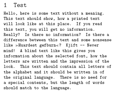
\documentclass{article} \usepackage[english]{babel} \usepackage{blindtext} \renewcommand*\familydefault{\ttdefault} \begin{document} \section{Test} \begin{minipage}{0.7\textwidth} \blindtext \end{minipage} \end{document} |
Output:
To get justification I just modify some of the font parameters above, that the spaces may be stretched and shrinked. I use the everysel package to ensure that my changes are applied every time the font is selected. Further I set the \hyphenchar to the – symbol.
\documentclass{article} \usepackage[english]{babel} \usepackage{blindtext} \usepackage{everysel} \renewcommand*\familydefault{\ttdefault} \EverySelectfont{% \fontdimen2\font=0.4em% interword space \fontdimen3\font=0.2em% interword stretch \fontdimen4\font=0.1em% interword shrink \fontdimen7\font=0.1em% extra space \hyphenchar\font=`\-% to allow hyphenation } \begin{document} \section{Test} \begin{minipage}{0.7\textwidth} \blindtext \end{minipage} \end{document} |
This is the justified result:
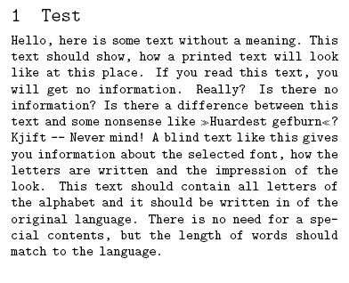
We get full justification and a good grayness of the paragraph. One line shows that hyphenation is active though it was rarely necessary.
This topic was discussed on CQF.info. In the LaTeX Community Forum we talked about similar issues with font dimensions.
pgf version 2.00 debian package released
On my Ubuntu 8.04 (“Hardy Heron”) the pgf/TikZ graphics package version 1.18 was installed. The pgf version 2.0 offers new features and is needed by newer documents and packages. A debian package of that version is now available.
For information and download see pgf (2.00-1) on packages.debian.org.
Installation on Debian and Ubuntu Linux:
sudo dpkg -i pgf_2.00-1_all.deb


