Periodically, more or less
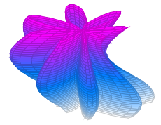 Recently I got my hands on the sine function, again. It’s the classic example for a periodic function. Everybody knows that horizontal wave in the cartesian coordinate system. Starting with a polar plot of a complex sine function in two dimensions I would like to visualize the function in three dimensions.
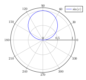
In polar coordinates, the presentation of the sine function is a simple circle, which is repeatedly tun through with raising or falling angle. The full circle matches the period length.
\documentclass[border=10pt]{standalone} \usepackage{pgfplots} \usepgfplotslibrary{polar} \begin{document} \begin{tikzpicture} \begin{polaraxis}[ domain = 0:180, samples = 100, ] \addplot[thick, blue] {sin(x)}; \legend{$\sin(x)$} \end{polaraxis} \end{tikzpicture} \end{document} |
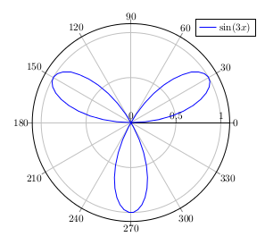
Shortening the period length, we get:
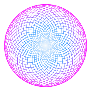
We can go farther – instead of a huge factor we could take a fraction, which isn’t a big divider of a small multiple of 360 degrees. We can get nice images, which won’t look like a simple sine or circle.
\documentclass{standalone} \usepackage{pgfplots} \usepgfplotslibrary{polar,colormaps} \begin{document} \begin{tikzpicture} \begin{polaraxis}[ domain = -14400:14400, samples = 3000, colormap/cool, hide axis ] \addplot[no markers,mesh,opacity=0.5] {1-sin(40*x/39}; \end{polaraxis} \end{tikzpicture} \end{document} |
If we would add a sine with different factor, we would get more movement – this is a plot I recently had onTeXwelt:
\documentclass{standalone} \usepackage{pgfplots} \usepgfplotslibrary{polar} \begin{document} \begin{tikzpicture} \begin{polaraxis}[ domain = -3600:3600, samples = 4000 ] \addplot[blue!50!black] {1 - sin(50*x/49) - sin(8*x)}; \end{polaraxis} \end{tikzpicture} \end{document} |
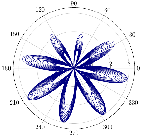
It’s hard to see the actual path though. To better see it, we could color it, dependent on the number of rotations around the origin, which means the angle. Or we take it to the third dimension: going higher with raising angle. This could provide a better view.
We generate a parametrical 3d plot in x and y. x runs through the full circle from -180 degrees to 180 degrees. We specify a sampling for y which stands for the number of rotations around the origin. We add y times 360 degrees to the function value. y serves as third dimension, as the height, while the angle x and the function value are the original two dimensions. Further explanation: here on TeXwelt.
\documentclass[border=10pt]{standalone} \usepackage{pgfplots} \begin{document} \begin{tikzpicture} \begin{axis}[ domain = -180:180, y domain = -19:19, samples y = 39, samples = 100, z buffer = sort, colormap/cool, grid ] \addplot3[data cs = polar, surf] ( {x}, {1 - sin(50*(x+360*y)/49) - sin(8*(x+360*y))}, {y} ); \end{axis} \end{tikzpicture} \end{document} |
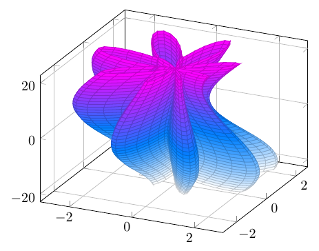
That shows the original intention of the blog post: showing how to use the third dimension for visualizing a complex polar two-dimensional function.


