Full justification with typewriter font
In a typewriter font aka monospaced font each character is given the same width. Monospaced fonts are frequently used by programmers to increase the readability of source code, but long text passages with monospace typeface are considerably less readable than those with variable-width fonts.
The space between words is fixed too, that prevents justification, and hyphenation may be disabled too. That’s useful for presenting source code, but sometimes a typewriter font is wanted but justification is required. This post will give some information how to fulfill that. We will use the Computer Modern Typewriter font (cmtt) you get by default when using \ttdefault, \ttfamily, \texttt.
The following code prints some of the font properties:
\documentclass[a4paper,10pt]{article} \renewcommand*\familydefault{\ttdefault} \begin{document} \begin{description} \item[slant] \the\fontdimen1\font \item[interword space] \the\fontdimen2\font \item[interword stretch] \the\fontdimen3\font \item[interword shrink] \the\fontdimen4\font \item[extra space] \the\fontdimen7\font \item[xspaceskip] \the\xspaceskip \item[hyphenchar] \the\hyphenchar\font \end{description} \end{document} |
The font cmtt10 is used, the result is:
slant 0.0pt

interword space 5.24995pt

interword stretch 0.0pt

interword shrink 0.0pt

extra space 5.24995pt

xspaceskip 0.0pt

hyphenchar -1
The space between words is 1em, the same is valid for the extra space following the end of a sentence. Zero stretch and shrink means the space between the words will always be 1em. The hyphenchar is set to -1, that’s why hyphenation is disabled. Let’s look how a normal text is set when typewriter is used:
\documentclass{article} \usepackage[english]{babel} \usepackage{blindtext} \renewcommand*\familydefault{\ttdefault} \begin{document} \section{Test} \begin{minipage}{0.7\textwidth} \blindtext \end{minipage} \end{document} |
Output:
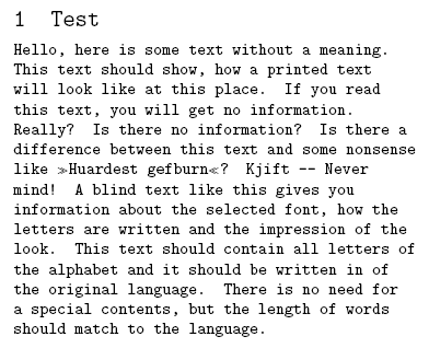
To get justification I just modify some of the font parameters above, that the spaces may be stretched and shrinked. I use the everysel package to ensure that my changes are applied every time the font is selected. Further I set the \hyphenchar to the – symbol.
\documentclass{article} \usepackage[english]{babel} \usepackage{blindtext} \usepackage{everysel} \renewcommand*\familydefault{\ttdefault} \EverySelectfont{% \fontdimen2\font=0.4em% interword space \fontdimen3\font=0.2em% interword stretch \fontdimen4\font=0.1em% interword shrink \fontdimen7\font=0.1em% extra space \hyphenchar\font=`\-% to allow hyphenation } \begin{document} \section{Test} \begin{minipage}{0.7\textwidth} \blindtext \end{minipage} \end{document} |
This is the justified result:
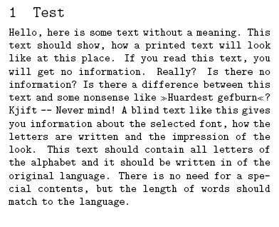
We get full justification and a good grayness of the paragraph. One line shows that hyphenation is active though it was rarely necessary.
This topic was discussed on CQF.info. In the LaTeX Community Forum we talked about similar issues with font dimensions.
Comments (11)
Leave a Reply
You must be logged in to post a comment.


Pingback: Transkription in LaTeX unter Ubuntu | Mythopoeia 2.0